

I don't understand it. Time after time I keep running into the same scenario - the movie poster looked great but the DVD cover is awful! What gives? What is it about marketing the DVD that makes the "creative" directors turn a perfectly good piece of movie art into a horrible Photoshopped piece of garbage?
It just doesn't make financial sense to throw out the old artwork in favor of new artwork that looks like it was thrown together in two minutes, especially when this is a product that consumers may be wanting to add to a collection.
It would be one thing to replace old artwork with something better, but why in the world would you commission cheap Photoshopped trash? Do the marketing strategists know something we don’t know? Perhaps it’s been determined that people will more readily buy a DVD if the cover looks like something made by a 9 year old. Are they designed strictly for passerby in Wal-Mart, with no thought whatsoever for the collector?
Simply put: The DVD cover is marketed to mass America, not movie lovers.
Of course, one could argue we're comparing apples and oranges. The movie poster has a different function than the DVD cover, and it is substantially larger, allowing for more elaborate artwork and blank space. This explanation has some credibility; however, is there really ever an excuse to turn out this kind of crap? I think not. These covers are bad, real bad.... inexcusably bad.
To illustrate my point, I've compiled a gallery of side by side comparisons of the theatrical poster (on the left) and the DVD covers (on the right). I think you'll see what I mean.
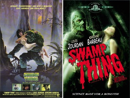
The DVD cover is a screen cap with a Photoshop filter applied. Estimated time to create cover art: approximately six minutes. I think the movie poster art did a good job invoking the slightly campy/cartoonish feel of the movie - and it harkens back to those old EERIE and CREEPY magazines.
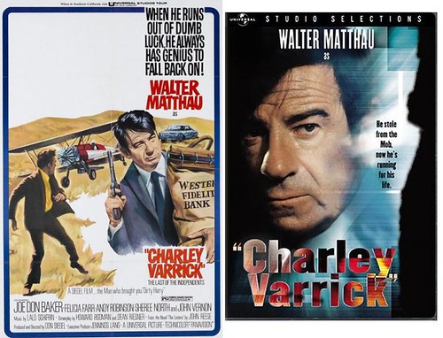
I wonder if the DVD designer was really proud of the "Charley Varrick" lettering. Some of the tackiest word art I've ever seen. And what exactly is that black smudge occupying the right side of the picture?
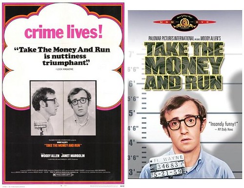
I love the artwork for this movie poster - it's fairly innovative with the title taking a backseat to the proclamation that "crime lives!". The DVD cover has Woody's face so overly Photoshopped he looks like a CGI character. The lettering has a money texture effect - how delightful.
What an "ingenious" composition - stick a meaningless screen cap between each of the blades! (yawn) That faux metallic lettering is an interesting choice - I've seen it used on WWF and muscle car magazine covers, but rarely in movie art of the 21st century. Interesting.
This one literally had me laughing it was so awful. The movie poster was brilliant IMHO; the DVD cover is a train wreck.

Something that could be made after 15 minutes of a Photoshop beginners tutorial should not become a DVD cover! I'm thinking the DVD distributor got his son to do it for an extra 10 bucks in his allowance.
What? That's the best they could do? Are you kidding me? I guess I should focus on the positive - at least they spelled everything right.
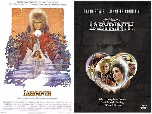
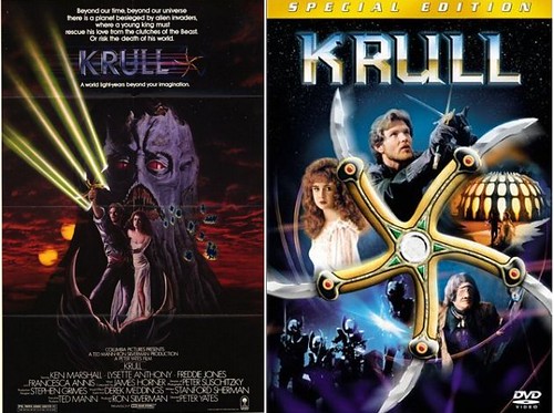
Whose bright idea was this? Take a great piece of fantasy artwork and throw it in the garbage in favor of 3 horrible screen caps in 3 Photoshopped circles.
The original artwork was painted by the legendary Frank Frazetta. The DVD artwork was created by an anonymous high school dropout in his mom's basement and emailed to the distributor for beer money.
Whew! (wiping sweat from brow) Stay tuned for part two, coming your way shortly.
