
To analyze every single DVD cover fail would take months. Simply put, a good DVD cover is the exception, not the norm. Some perfectly good movie posters from yesteryear have been cast aside in favor of novice Photoshop work. These are not just bad, they are outrageously bad, as you will see as we continue browsing through examples. (If you missed part one, go here) The movie poster art is on the left, and the DVD cover is on the right (as if you needed me to tell you that).

OK. I get it. They wanted to highlight the fact that Hollywood bigshot John Cusack is in it. I can understand that. What I don't understand is this Photoshop disaster going on with the sunglasses and the dangling mini-Cusack.
I think this must have been a homeschooler project.
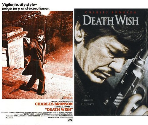
Could this be the most boring image imaginable for this movie? A plain box would have been more exciting. I wonder if the Death Wish II DVD cover will feature Bronson taking a nap on the couch.
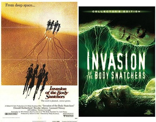
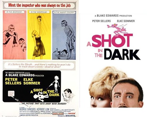
I think this movie poster is utterly brilliant. The DVD cover, on the other hand, is hopeless crap. 'Nuff said.

I'm not hear to claim these movie posters were works of high art: they are no different than an advertisement - they serve to sell the product. The Inseminoid artwork certainly goes all the way with this one, and as far as B-movie posters go, this one delivers. The DVD cover, in stark contrast, is about as inept as it gets.
One of my pet peeves is when faces are overly smoothed to the point where they look like polished plastic. This shitty DVD cover doesn't even show their complete faces. Note to designer: make the title smaller or make the faces smaller - don't just cut them off at the upper lip. It makes it look like a mistake in printing.
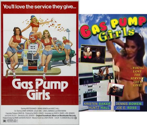
The horrible font might be appropriate for a kiddie movie, but 70s softcore? And by the way, this is not a bad copy of the DVD cover - she really is that blurry!

Yet another great piece of movie art cast aside in favor of more rubberized, polished and smoothed faces. Michael Douglass' face is so overly retouched, he's unrecognizable. Is the ladder he's climbing resting on her back?
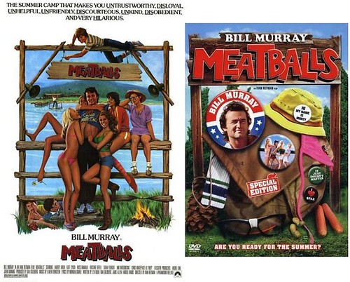
Here's my idea. We'll throw away the amazing poster art and randomly piece together a bunch of meaningless crap from the movie. Then, we'll put Bill Murray's face on a big patriotic button for no reason. Next, we'll eliminate any trace of sex appeal - bikini chick and hot pants chick GONE! Instead, we'll throw in a couple peanuts and weiners. Whadya think? I am I awesome or what?

20th Century Fox is owned by Rupert Murdoch, one of the richest people to ever inhabit the Planet Earth. Evidently, very little of the money makes its way to the DVD art department.

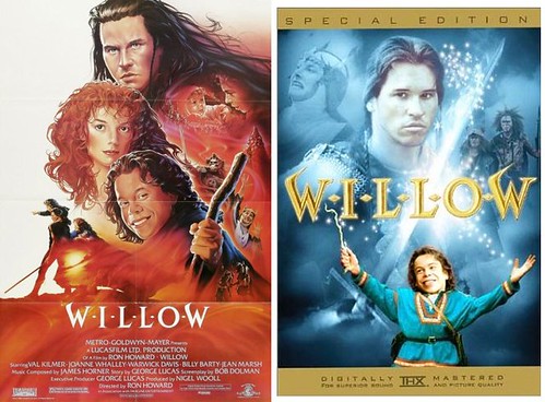
Could this possibly be more boring? I don't mean that rhetorically. I'm being serious - could this be more boring?

